For the fifth assignment, I had to select my own project with the proviso that the subject should be related to the material in the People and place module. I started out with some grandiose ideas but then common sense prevailed and I realised that I would need to choose a topic that could be developed around a location that was close to where I live so that I could easily visit it enough times to obtain a satisfactory set of pictures. As I live in an area that is popular tourist destination in summer I decided to work around the idea of people holidaying in Britain or taking a staycation as the popular press likes to say today.
Within ten to twenty miles of my home there are many different types of holiday destinations, firstly there is Burnham Market or “Chelsea-on-Sea” as many locals refer to it which is dominated by affluent second home owners mainly from London. Then there are coastal towns being rapidly gentrified like Wells-next-the-Sea, several wild life sanctuaries visited by keen bid watchers and finally Hunstanton a traditional British seaside resort.
In some ways Burnham Market would have been an interesting topic showing how the upmarket shops and restaurants and often ostentatious displays of wealth make it very different to other surrounding towns and villages. However, in the end I decide to focus on Hunstanton and try to show what a holiday at a traditional British resort is like in 2017.
Client Brief
I wrote my self the following brief for this project:
Deliver 8-12 photographs that document what people could expect from a holiday in Hunstanton in 2017. To illustrate one of a series of magazine article about the different types of holiday destinations in East Anglia. This is not intended to be a series of articles marketing resorts by glossing over the realities of life with dramatic sunsets etc but rather a true picture of what each these resorts are like. Neither should the pictures resemble those used in marketing brochures or on postcards.
Planning
Following the feedback from my tutor on my last assignment I looked the work of Vanessa Puntener a Swiss photographer who has produced several projects around life in the Alps and Martin Parr’s famous work “The Last Resort”. It was not my intention to try and create a vision of Hunstanton that was as bleak as Parr’s vision of New Brighton. Although for many years Hunstanton has always been a little shabby and in places a little run down it has never had the piles of litter in the streets that Parr shows in New Brighton. Hunstanton is a small resort town and over the years it has largely survived on day trippers and caravaners it has never suffered the level of depravation that has been seen in larger resorts.
My original intention was to create a set of pictures of people obviously enjoying themselves on the beach, the promenade and around the town. I didn’t wat to take pictures of the sunsets the area is famous for or the gardens along the cliff tops that appear in every brochure published by the local tourist board.
When planning the shoots for this project I started off by writing lists:
What makes a good holiday, eg
- Sun, sea and sand, pony rides, fun fair, amusement arcades, entertainment, food
Key places in Hunstanton, eg
- Beach, promenade, gardens, stripped cliffs, beach huts, golf, crazy golf, bowling green, sailing club
What do we associate with seaside resorts, eg
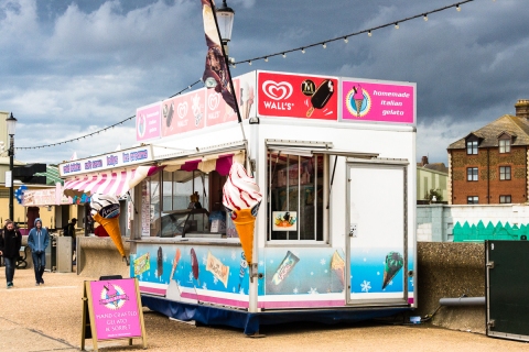
- Fish and chips, café’s, ice cream parlours, souvenir shops, rock, colourful buckets and spades, nets for rock pooling
Merging items from the different lists I ended up with about 50 ideas of shots I could try and capture: eg
- Families on the beach
- Eating take away on the promenade
- Colourful displays in shops
- Looking out from pub or café
- Panic in beach hut
- Water sports eg Sailing, kite surfers
I spent a lot more time preparing for this assignment that I have done in the past and while I did not end up capturing pictures that fulfilled many of my initial ideas having a list of potential subjects did help me focus on areas and not wander around just looking for a shot aimlessly.
Taking the Pictures
I visited Hunstanton six times and took more than a thousand pictures while working this assignment, I was there in bright sunshine, cloudy conditions, rain, high winds all the kinds of weather you get at an east coast resort in summer. What became increasing clear to me over the first two shots is that whatever the weather few people seemed to be enjoying themselves. There were many more miserable people than happy people. Initially I went out looking for happy scenes but it increasingly became clear that the more interesting picture were those of people who were not obviously enjoying themselves and gradually my theme moved to the grim reality of seaside holidays and far away from my initial concept.
My final selection of twelve photographs is show below followed by my reflections on this work.
Staycation
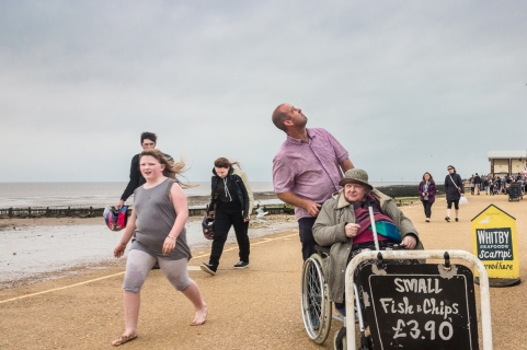
The twelve pictures below capture a view of a holiday in Hunstanton, they portray it as quite a grim experience in doing this I am not trying to be disrespectful to the people in the pictures or to the town rather I hope I have captured the experience for some people that is very different from that pictured in tourist publications.

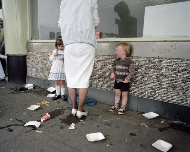
Chalet Life

True Grit
Is that rain?

Before the rain

Inclusion
Wishful Thinking

Why isn’t it like yesterday?

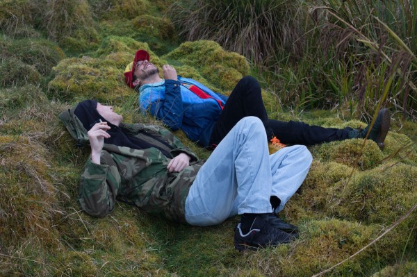
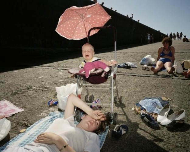
Resting

Why am I here?

Even the dog is suffering

I take my dog everywhere

Time to go home?
Reflections
I tried in this series of photographs to capture a vision of the reality behind the glossy picture people often have of seaside holidays. I have shown these pictures to several people and the overwhelming response I get is how grim and depressing they make Hunstanton and its holiday makers look. I have not captured what I had in mind when I wrote the original brief but I believe that I have created a set of pictures that capture the experiences some people get from a day by the sea.
If these were to be used to illustrate a magazine article it could not be one that was promoting the pleasures of a holiday in Britain. Perhaps they could illustrate an article charting the gradual re-emergence of British resorts as they pick themselves up from what were much worse times twenty or thirty years ago.
One of the difficult decisions I had was whether to select these pictures or a set that showed a more positive side of Hunstanton. In the more than 1000 pictures I took during my visit to Hunstanton there are a lot of happy people enjoying themselves. However, the more times I visited the more I was struck by the number of miserable people and eventually I concluded that this had to be my theme.
As I said in the introductory text above I did a lot more planning for this assignment than I have done in the past. As I knew the town from many visits in the past I could plan several locations for shoots along with the pictures I hope that I would get in each one. In general, I believe that this really helped although in many cases I never got the pictures I had visualised as I was creating my plans. However, I do think that during this assignment I have learnt the value of planning and returning to a location several times. In many of the earlier exercises on this course I just walked the streets with some vague ideas of what I wanted to shoot and while I got some good shots it did take much longer than the more focused approach I used here. Making several visits enabled me to review the work I had and identify gaps that I needed to fill in a narrative and to be able to reshoot ideas that had not quite worked.
Thoughts on the pictures
In “Chalet Life” and “True Grit” I was trying to capture the determination people have to enjoy themselves on a seaside holiday. Perhaps “True Grit” is really about the determination to redo things that the woman had done in the past?
Rain is an ever-present feature in a British holiday, “Is that Rain” and “Before the rain” try to show how people try and work around rain.
“Inclusion”, today the seaside is a very inclusive place; young, old many people from different ethnic background and to me this picture really captures this theme. Whoever you, whatever your problems you can come to the seaside
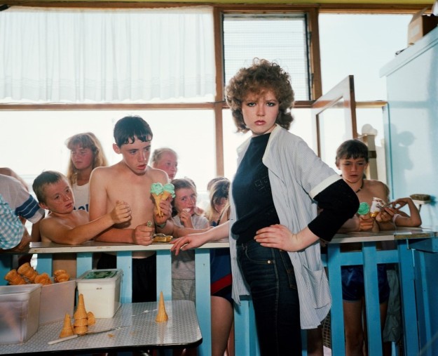
“Wishful thinking” and “Why isn’t it like yesterday?”, some days the traders along the promenade have bad days either the weather is bad of perhaps it is just that no one shows up. Years ago, the beach would have been packed every day in the summer and café’s full but those days have ling gone.
“Resting”, “Why and I here” and “Even the dog is suffering” are trying to question why people come to Hunstanton when apparently, they hate either the seaside or the people they are with. Do they have some sense of duty that causes them to visit or are they just trying to relive happy childhood memories? With resting I did consider cropping out the child on the right hand side but in the end I preferred the picture with the child there
“I take my dog everywhere”, I couldn’t resist this shot, why take your dog in a push chair to play bingo? The inside of the arcade also really reflects the faded glory of many of our seaside resorts.
“Time to go home”, I think this picture sums up the thoughts of many people who visit seaside resorts when the weather is less than perfect.
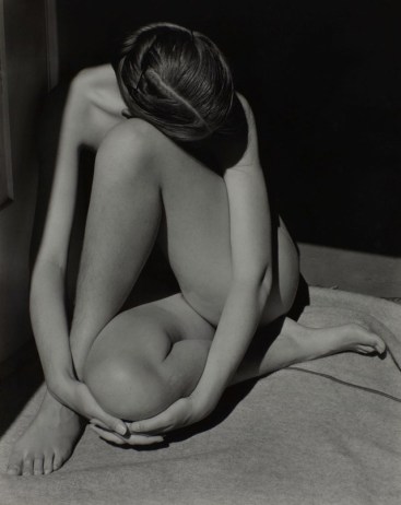
As I said at the start of this post I did look at the work of Martin Parr and Vanessa Puntener at the time I was starting on the assignment. While I did not go out and try reproduce the style of either of there artists work Puntener’s work did encourage me to include some wider shots to give context to the my images and show that these are photographs of a seaside resort. As I said previously I really did not want to create a Parr like vision of Hunstanton but perhaps there is more Parr influence here that I was consciously looking to include. The amusement arcade picture and the couple ignoring each other outside the Chalet have some echos of picture included in the last Resort but I was not thinking about this when I took them.


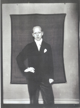
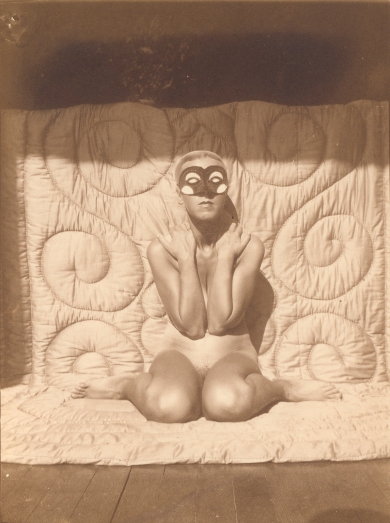
 This exhibition was interesting if at times unbalanced and a little muddled, its overall theme seemed to be around creating and manipulating identity. Both Claude Cahun and Gilliam Wearing have created work that shows them moving between genders and personas in their photographic self-portraits. Cahun was part of the Surrealist movement in the 1920s and much of what remains of her work dates from then. Wearing is working today and acknowledges Cahun as one of her influences.


")
")