Category Archives: Exhibitions

Gillian Wearing and Claude Cahun: Behind the mask, another mask


WaringThis exhibition was interesting if at times unbalanced and a little muddled, its overall theme seemed to be around creating and manipulating identity. Both Claude Cahun and Gilliam Wearing have created work that shows them moving between genders and personas in their photographic self-portraits. Cahun was part of the Surrealist movement in the 1920s and much of what remains of her work dates from then. Wearing is working today and acknowledges Cahun as one of her influences.
The exhibition starts with one Cahun’s images from her series “I am in training do not kiss me” along with Wearing’s homage to this work called “Me as Cahun”. Cahun’s image gives the impression of her as a circus act sitting heavily made up holding what, today at least, look like rather comic dumbbells. To me this sense of humour is largely missing from Wearing’s picture in which she is wearing a mask and makeup took like Cahun, sitting in a very similar pose and holding another mask.

When writing about an exhibition like this there is always a temptation to present it as a competition, who is the winner the 1980 Surrealist or todays conceptual artist? I do not want to fall into that trap so I will discuss each artist’s work independently before drawing some comparisons at the end.

Claude Cahun

Claude Cahun was one of the few woman Surrealists in Andre Bretons group in the 1920s but her work was largely forgotten until she was rediscovered in the 1980s. Since then her work has featured in many exhibitions around the world.
Due to her sexual ambiguity Cahun’s work is very much in tune with the sexually ambiguous looks that are popular with today’s Instagram generation. She has been called by critics “Cindy Sherman before her time” and has been positioned her as a forerunner to the work on many artists working today. However, there is no evidence Sherman or many other artists whose work critics claim was preceded by Cahun had ever heard of Cahun before she was rediscovered. However, Gillian Wearing is of a few artists who does acknowledge Cahun as an influence.
Cahun has a complex character, born Lucy Schwob she changed her name to one she regarded as being gender neutral and in her self-portraits, she appears in both mescaline and feminine dress.
Some of her work has a surrealistic style, notably the picture below of her reflected in a mirror with close cropped hair and sexually ambiguous dress. As her eyes are looking to the right the camera her reflection in the mirror looks quite different from the face the camera sees directly. It almost looks like we are seeing her twin through a window rather than two pictures of the same person. Considering this work was created in 1927, it looks very modern, It has a style that is reminiscent of the 1980s or perhaps even more recently.

Mirror
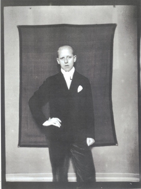
The picture below of Cahun as “a dandy” shows a very male persona both in dress and pose. This picture is perhaps a typical example of a  Cahun self-portrait in a masculine persona it shows that rather than just dressing in male clothes she is able to project through her pose more of a male presence and does not look like many pictures of women in drag.
claudecahundandy
In another work from the 1920s she appears in a female persona wearing a clock decorated by masks. We can think about this image as having a message, which is the real me the face you see or one of the masks?

cahun-masks
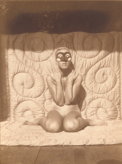
Masks appear in several Cahun’s works, like the one below her posing naked except for a mask.
021-self-portrait-kneeling-naked-with-mask-1995
Cahun was imprisoned and even at one time sentenced to death during the Nazi occupation of Jersey. Shortly after the war she is seen in the self-portrait below dancing on a sea wall that had been built by the Nazi’s this image a care free celebration is perhaps a comment on the defeat of the Third Reich or just an expression of joyous relief that occupation is over?
Claude-Cahun-Self-portrait-on-sea-wall-1995.31m
In a more obvious way the picture of her biting on a Nazi medal seems to be a clear statement of victory over the Nazis.
Nazi
Claude Cahun wrote “Behind this mask another mask, there can be no end to these disguises”, this thought is reflected in some of the examples of her work above. Which is the real Claude Cahun? Dressed as man she doesn’t look masculine but neither does she look like a woman in drag similarly dressed as a woman she does not look feminine but again neither does she look like a man in drag. Her work is all about creating her own identity or perhaps many different identities to mask her true personality.
Claude Cahun’s work was largely forgotten until she was rediscovered in the 1980s.In her latter life she lived in Jersey and much of her work was destroyed during the Nazi occupation but what remains has made her something of an icon for art critics who have praised her blurring of gender and identity and recognise in her work themes that are much more common today

Gillian Wearing

Gillian Wearing is one of the so called YBAs (Young British Artists) who emerged in the late 1980s she is best known for her work documenting everyday life through photography and video. A lot of her work focuses on individual identity and blurring the line between reality and fiction. This exhibition is not a full retrospective of Wearing’s work rather it focuses on her self-portraiture. In this work as she often uses makeup and more recently computer image processing to appear as others or herself at different times of her life.
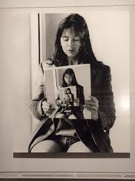
Position in one of the first parts of the exhibition was a work with a similar theme of multiple personas to the Claude Cahun mirror picture above. In Wearing’s self-portrait, she is seen sitting holding a picture of her sitting holding the same picture giving the idea of an infinite number of persona’s rather than just two in Cahun’s work.

wearingmirror

Masks also play a significant role in Wearing’s work, she has used masks in a series of work where she recreates herself at different ages, for example “Self Portrait of Me Now in Mask” shown below. Initially this work looks like a straight forward self-portrait but looking closer around the eyes the edges of the mask can be seen, looking more closely the mask gives a rather unrealistic almost frozen appearance to the portrait.

wearinginmasknow
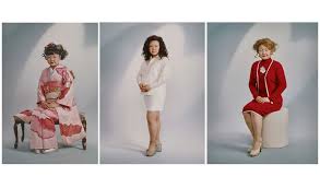
Waring has also used masks and other prosthetics to appear is self-portraits as other members of her family or other famous people. The works below “Self-portrait as my brother” and “Me as Mapplethorpe” are examples of this aspect of her work. In all this work Wearing is stretching the idea of self-portraits and confusing the concept of persona.

Finally, there are examples of portraits by Wearing of other people where masks are feature, for example the portrait of Shami Chakrabarti the human rights lawyer and campaigner where Chakrabarti holds a mask of a sterner looking version of herself. This portrait is a response to those people who in the past criticised Chakrabarti for her worthy mask like face but in the context of this exhibition it appears as yet another way presenting different personas or perhaps question what is the real persona of the subject.
NPG 6923; Shami Chakrabarti by Gillian Wearing
Before visiting this exhibition, I had not been aware of Cahun’s work and had not really looked at Wearing’s work beyond the series of pictures of people holding up signs on which were written statements which represented what they wanted to say. I really enjoyed the exhibition and found it very thought provoking, I wish I had seen this work before starting the people and place module. If I had I would have taken a very different approach to some of the early exercises and assignments.

The Radical Eye

The Radical Eye: Modenernist Photography from the Sir Elton John Collection
Tate Modern, Nov 2016-May 2017

I went to see this exhibition twice while it was on, once shortly after it opened in November and once in January. On both occasions, I thought I was one of the most best exhibitions have seen for a long time. As well as feature the work of photographers I had studied while working through this module eg Irving Penn, Richard Avedon and Paul Strand it also featured work by photographers I have long admired Man Ray, Edward Weston and included original prints of classic 20th century works like Dorothea Lange’s Migrant Mother.

With such a wide-ranging exhibition of great works it is hard to know where to start when writing a review so rather than trying to write about the full range of work I will focus on a few works that really stood out for me.

Firstly, the portraits of Irving Penn really stood out for me, perhaps this was because I had done some research of Penn’s work before visiting for the exhibition for the second time. I was surprised by the power of this work particularly the portrait of Salvador Dali where the sitter really dominates the tight space he is posed unlike the portrait of Noel Coward who seems to be intimidated by the space and is apparently trying to shrink back into it.

For some years I have admired the very precise work of Edward Weston and seeing the classic 1936 nude study below with its careful pose and lighting in its original form was something of a revelation.

1194358

I have always liked the work of Man Ray and the chance to see prints of many of his works was good, if I had to pick one of the it would be Tears shown below. I really like the way the woman is staring upwards, almost like a silent movie star expressing excessive emotion which is echoed by the huge glass tears.

download

The very surreal headless swimmer captured by Andre Kertesz in his “Underwater Swimmer” was another picture that stood out for me. It is a great example of a photographer capturing exactly the right moment so the swimmers head effectively invisible. Also, this work was displayed as a contact print which made it appear like a little jewel that you needed to stare intently add to appreciate all the detail.

images

Although I have largely picked out portraits and other pictures of people there were also a lot of other types of work included. There were many examples of close-ups of objects out of context and architectural studies using exaggerated perspectives. Of this work, I liked Aleksander Rodchenk’s picture of the Shukhov Tower taken in 1927. Today this type of perspective distortion is common but it was new in the 1920s and it really seems to work with this curved steel tower probably making it look much more interesting that it really is.

images (1)

The one picture in the exhibition that disappointed me was Edward Steichen’s portrait of  Gloria Swanson. I had seen another print of this in a exhibition in the USA a few years ago and had been very impressed but the print at the Tate just seemed dark and gloomy. Perhaps this was the effect of the wide gilt frame the print was mounted in? Whatever the reason it really didn’t have the impact of the previous version I had seen.

download (2)

This exhibition was a rare chance to see such a large collection of famous works in one place, generally I thought that in most cases seeing the original prints gave me a much better opportunity to appreciate the work than looking at what I increasingly realise are rather poor reproductions in most books.

Wolfgang Tillmans 2017

Tate Modernwtticketetc

16th April 2017


I didn’t really know much about Wolfgang Tillmans before visiting this exhibition, I had seen many posters around London advertising it and I had heard the name in the past. It was probably when I got into the third of fourteen rooms making up the exhibition that I began to think is this about the individual works or should the whole exhibition be viewed as a single installation. The rooms were full of images both large and small, framed and unframed, isolated and in large arrays. There were display cases of pages torn from magazines, books and images scattered on tables. In many ways, the exhibition is compelling it pulls you in and leaves you wondering what is coming next.  The photographic work is very varied, abstracts, portraits, still life, street scenes etc. Initially the work almost has a feeling on randomness or naivety but it soon becomes clear that there are clear political themes running through the works showing Tillmans as a dedicated, socially aware artist who uses his work to promote his views.

Some of Tillmans‘ work features staged pictures of his friends like the one of Juan Pablo and Karl below, these are often mistakenly thought of as documentary work whereas in fact they are careful conceived and executed to make a statement.

2012-184_juan_pablo_karl_chingaza-Tillmans

There is also a lot of quite intimate portraits of both famous and anonymous people, although the picture below stretches the definition of portraiture to me it fits well into this intimate strand of Tillmans’ work.

2011-114_collum_a4_2

The anonymous Indian man below  standing next to what we assume must be his purple  car is another example of one of Tillmans’ portrait themes which he has repeated worldwide. What does this work show? Perhaps that the possessions young men take pride in is similar all over the world.

promo_MP-TILLW-01094-A-300

Greifbar 29 that was used on many on the cover of the exhibition catatalog and many posters advertising the show shows another side of Tillmans. This is not a photograph taken with a camera but rather an image made by carefully controlling how light and  chemicals react with photosensitive  paper.

greifbar2029202014_6

Another set of abstract work I liked was the photodrop series on of which is show below, it took me a while to realise that these are just very carefully positioned and  light folded sheets on inkjet paper.

2014-058-paper-drop-Prinzessinnenstrasse-a-_A4

Finally there are a number of still life pictures, the famous on below of the discarded crustacean shells with a large fly, perhaps a commentary on mortality?

wtastrocrustoa2012

I thought when hung as a fifteen-foot-high print the picture of the weed below was stunning, not so much for the size of the picture impact but rather as an example of how great works can be made from any subject. I am sure this was not a found scene, I suspect other plants were removed and the decaying leaves carefully placed before several lights were carefully arranged to create this scene but that doesn’t detract from the work.

weed202014_2

In many ways, this was a roller coaster of an exhibition sometime times a little dull, sometimes joyous, sometimes challenging but every one of the works seemed to have a quite clear underlying message.

Horst – A Photographer of Style

In  January 2015 I went to see the exhibition Horst a photographer of style at the Victoria and Albert museum and I remember being very impressed by the work so much so that I brought a copy of the catalogue. When I was researching Richard Avedon and Irving Penn for the reviews I wrote earlier in my log book Horst’s name came up several times as a leading example an earlier generation of fashion photographers so I decided to go back to my copy of the catalogue and rather belatedly write up my thoughts on the exhibition.

Although Horst was certainly an innovator he works does seem quite dated compared to the work of Penn and Avedon. In some cases the clothes and style of his models is so 1930s but also a lot of the poses he uses seem seem very much in a art deco style rather than the more modernist style of Penn and Avedon.

Horst is perhaps best known for his dramatic use of light and contrast in his early fashion work he spent a long time working on perfecting the lighting of the clothes and as a result often had his models faces very lowly lit of even in darkness. His style very much echoed what is known as Chiaroscuro which was developed by Caravaggio among others in renaissance and later oil painting.

The three fashion shots below are fairly extreme examples on Horst black and white fashion work. Light is used carefully capture the line and the way the material of the dresses drapes but the models are largely anonymous. This is approach very much different from supermodel era when at times the model is perhaps more important that the dress.

Despite being a regular contributor to Vogue in the 1930s Horst’s Dramatic lighting style was not universally popular indeed in 1937 the chief editor of Vogue drafted a memo that included the phrase

“I have been lecturing Horst about the lack of light in his photography. We have simply go to overcome this desire on the part of our photographers to shroud everything in deepest mystery”

Even Horst’s portrait work in the 1930s was characterised by a carefully controlled play on light and shadows as illustrated by his photograph of Marlene Dietrich below

Horst was also relaised the valueof retouching writing copious instructions for the people who retouched his work. Many of his photographers were extensively retouched before being published, one famous example included in the V&A exhibition was his picture of the Mainbocher Corest that was taken in 1939 in the published version shown on the right below the corset appears to perfectly wrap around the model but in the original unretouched picture on the left the corset appears very rigid on the left hand side of the models back and really doesn’t fit well at all. This picture is not only a great example of Horsts skill in balancing light but also the skill of the retoucher who had to carefully paint in the left had side of the models back up to her shoulder to give the illusion of a perfect fit.

In the 1930s and early 1940s Horst became one of the first fashion photographers to embrace the emerging technology of colour photography. His work with colour started out being quite different to his work in black and white his pictures had bright saturated colours with some carefully placed shadows but the “lack of light” was no longer in evidence. When looking through the exhibition at the V&A and reading that all the colour photographs were new prints I did wonder if the these modern prints were much more saturated than the originals. However, surviving copies of Vogue that contain this work show that this probably was not the case.

Later in the 1940s he seem to return to embrace Chiaroscuro in his colour work as in the photograph below that was taken in 1947 which show much more dramatic lighting that his earlier work above.

Although Horst survived until 1999 and continued taking photographs throughout his life he moved away from fashion photographer at the end of the 1940s


Taylo Wessing Photographic Portrait Prize 2016

I visited the exhibition of the entries in the Taylor Wessing Photographic Portrait Prize before I had seen reports of the winners and when I got there I first walked around quite quickly before looking at which entries had won awards to try and avoid being overly influenced by the judge’s decisions. Following this I walked around slowly looking closely at the work and taking in which portraits had won awards.

As soon as I saw it I really liked Claudio Rasano’s portrait of the South African schoolboy in his school uniform. There is something striking about the intensity of his gaze, he has something of the expression of a sullen teenager and perhaps the way his tie hangs outside his blazer  hints at a certain rebelliousness.

The second portrait I liked was Kovi Konowiecki’s portrait of Shimi beitar IllIt and Orthodox Jewish violinist. This picture was part of a series that Konowieck took depicting the members of the family. It is hard to say what I really like about this, I think it is probably the contrast between the figure in formal religious consume with a very serious expression captured in front of what is loud floral wallpaper. I don’t think this portrait would be anything like so successful had it been shot against a plain background.

My next pick is Andy Lo Po’s portrait of Simon Callow in which from a distance the tonal balance looks almost like a water colour painting. It also shows a side of Simon Callow that perhaps we are not used to, for someone who has such an exuberant personality in this picture he looks strangely contemplative.

Josh Redman’s work “France, February 2016” won the award for best new work and to me it is a very striking picture of an older sitter in a pose that would normally be used for much younger subjects. There is something very classical about the lighting, it reminds me of style of some renaissance painters. Also, France’s expression indicates she is really enjoying her first steps into modelling at the age of 83.

Finally, Charlie Clift’s portrait of Nigel Farge, where you like his personality or his politics to me this picture really captures the buoyant self-confidence that is he public persona.

Malick Sidibé – the Eye of Modern Mali

Somerset House
November 2016

Malick Sidibé was a photographer based in Bamako in Mali where starting 1958 he ran a small studio taking portraits for many years. He was recognised by western art curators and dealers  in the early 1990s and since then his work capturing local people and culture in black and white images has been exhibited widely in Europe and America. This exhibition at Somerset House focused on pictures taken Mali’s became independent in 1960. These pictures from the 60s and 70s  show a culture evolving as Mali throws off the constraints of colonialism. The pictures capture evidence of the population adopting the style and pop music of Europe and the US while retaining an African heritage.

The first group of pictures captures the night life in and around Bamako, these are the pictures that first built Sidibé’s local reputation. Apparently, he used to cycle from party to party with his Kodak Brownie and flash gun. The following day he would process and print his pictures displaying them at his studio for people to admire and buy. These pictures capture the growth of a youth culture in Mali that is obviously derived from that in the in 1960s Europe and USA.

I have chosen two pictures from this section of the exhibition below, the first entitled “Night of 31st December 1969” shows a woman apparently walking up a flight of steps to join a party. It has the very harsh light and shadows from a single flash that picks out the figure but leaves the background in deep shadow. The woman is looking directly at the photographer and has an expression that looks like anticipation. To me this is a very strong portrait that where the subject is really communicating her desire to attend the party.

The second night life picture is typical of many in the exhibition in that it captures dynamic dance moves in a very happy environment but it also contains a simmering sexual tension whichseems typical of the changing cultural norms in the 1960s.

The second series of pictures was called “Beside the Niger River” these represent a move away from the dynamic nightlife pictures to a more laid back vision of the youth relaxing beside the Niger River. Again, you can see the influence of European and American culture way in the way some people are dressed but again there is also a nod to African culture in most of the work.

The first picture I chose from this section shows a group standing on the banks of the Niger, the figure in the centre of the frame is striking a pose which indicates that he is important, perhaps the leader of the group? The younger boy to the right seems to be staring thinking I want to be like that one day while the girl in the background with her arms folded seems to be looking on rather disapprovingly. This picture can tell many stories; perhaps the figure in the centre is staring at another woman or even squaring up to someone out of shot about to start a fight?

The second picture shows a man and woman in swim wear squaring up to each other each holding a rock. To me the figures here give the image a very African quality but the way they appear against a very pale grey background is very reminiscent of the western modernist style of photography.

The final section of the exhibition showed Sidibé’s studio work although Africa had an established tradition of studio photography by the time Sidibé open his studio he is considered to have reinvigorated the genre. He encouraged his subjects to become more animated in front of the camera, to bring their own props or select one of the studios hats and ties if their outfit needed to be accessorised. The small studio just 3 by 4 meters was draped in fabrics to use as backdrops or floor coverings. Sidibé also took great care in posing his subjects so they could project the image they wanted.

The first picture shows a man in what is presumably his new suit, I guess even in Europe or the US such suits were available in the late sixties and early seventies but I cannot imagine a portrait photographer shooting this against the striped background and the highly-patterned carpet. A number of the portraits in the exhibition featured this background and carpet so it must have been a popular setting to pose in front of.

The final picture I have selected is the cool dude below showing off his sharp suit, the pose and the beret all say that this is an important person. In the west you might assume that he was a drug dealer or gangster but I am left wondering if I can make this assumption in this African culture.

I really stumbled on this exhibition by chance but I am pleased that I got the chance to see it. The work is very thought provoking, it captures a very dynamic time of change in a culture that is very different to my own. Many of the pictures tell stories, perhaps some of them I see though my cultural vision and perhaps some are just universal I’ll probably never know.


Henri Cartier-Bresson: Paris

Henri Cartier-Bresson: Paristicket
Sainsbury Centre for Visual Arts
University of East Anglia
20th May 2016


Henri Cartier-Bresson has always been one of my favourite photographers and a couple of years ago, when I was studying the Art of Photography module I wrote a piece about his work. I was very pleased when the Sainsbury Centre in Norwich, a relatively short journey from my home had an exhibition of his work featuring photographs of Paris that included some of his most famous images. In the past I, have looked at Cartier-Besson’s work in books and on the Internet but seeing the collection of prints in a gallery was a revelation in terms of the extra subtle details that are not immediately apparent in reproductions. As an example, Cartier-Besson’s Behind the Gare St. Lazare has always been a favourite of mine but having only seen it reproduced in books or on line I had always felt that some of the comments in criticisms of the picture were a little stretched. For example, in Train you gaze by Roswell Angier, one of the set books for this module, she discusses how the man leaping rhymes with the picture of the ballerina in the poster in the background. In the reproductions, I had seen this poster was barely visible but in the print in the exhibition it was very clear and the similarities between the poses jumped out at the viewer. Since attending the exhibition I found the image below which is a better reproduction in this respect than many others I have seen.

cartier-bresson-henri-iza-gare-st-lazare-paris-1932

The images I and I suspect many others mentally associate with Cartier-Bresson are those of lovers in Parisian cafés and indeed there were a number of examples of this genre in the exhibition. I particularly like the one below with the woman wearing a typically French stripped top and the dog underneath the table staring upwards perhaps in expectation of being feed some titbit or at another level perhaps indicating it disapproval. Whatever the message Cartier-Bresson was trying to convey this is a good example of him capturing the ‘decisive moment’ if the dog wasn’t looking up at the woman in the way it is this would not be such a great image. A picture taken a few seconds before or after with the dog apparently lying asleep would not have anything like the same impact.

images

As another take of the theme of Parisian lovers I like the picture of the dogs below, again it captures just the right moment with the two dogs having sex and the other too dogs really not interested in what is going on we can see it as an allegory of the way humans tend to ignore behaviour they find embossing or rather than confronting it.

dogs2

I really like the picture below taken in the infamous Citron factory in Paris where the 2CV was built, this factory was renowned as a place where a largely immigrant workforce produced cars in truly terrible conditions. To the extent that in later years Citron would not allow visitors of picture of the interior of the plant. I could not find a larger image of the is picture on the Internet but I particularly like the way Cartier-Bresson has captured the worker with his face hidden by the hanging vehicle parts which combined with the way he is slouching along giving him an almost robotic appearance.

HCB1959008W05349/44C

The final picture I really liked is the one below of the three market traders, I see this as a picture of its time in that the three subjects are obviously posing for the camera and really trying to portray their best tough guy image. Today with everyone one taking pictures with mobile phone it would be hard to capture a picture like this. Due to the familiarity people have with cameras getting three traders like this interested in posing at the sometime would be almost impossible without some very elaborate planning and staging.

97v5g9u

Overall I really enjoyed visiting this exhibition and I was disappointed that I could not get back to see it a second time before it ended. As I said at the beginning I had always admired Cartier-Bresson’s work and to have the opportunity to see some many examples of his work in one place was fascinating and really re-enforced to idea of capturing the decisive moment that Cartier-Bresson is famous for. After seeing the work I was motivated me to get out and take more street photographs but I must admit that I was so impressed by my results but I will keep trying.

Oshiuchi Miyako – Postwar Shadows

The Getty Museum – 20th February 2016

This exhibition was a major retrospective of the work of the Japanese Photographer Ishiuchi Miyako. Ishiuchi was born Fujikura Yōko in 1947 and grew up in Yokosuka a Japanese city where the USA established a major naval base in 1945. She studied art in Tokyo in the late 1960s but dropped out of the course. She took up photography in 1975 and started exhibiting under her mother’s maiden name, Ishiuchi Ishiuchi, the same year.

Looking through the groups of work in this exhibition it was really clear that Ishiuchi’s work is really dominated by the aftermath of the second world war and its impact on Japan. Throughout her career she has worked developing themed sets of work many of which hark back to the war and its impact of people and places.

The first body of work in the exhibition was “Yokosuka Story” which formed the basis of her fist show in 1977. This work captures the city of Yokosuka where she grew up and presents it as a dark and somewhat dangerous place. In part this sense of hidden danger is due to the large US Naval base in the town and the resulting clash of cultures that must have occurred through the 1950s, 60s and 70s as Japan changed from being defeated nation to a major industrial power. Typical of the work in this section is the work below which shows the back of a US sailor either pulling a drunken comrade or perhaps a prostitute across a road24533-mii-hi-s-

Other works in this section had a more hidden sense of danger or fear for example the picture below of the little girl apparently rushing away in what looks like a very forbidding neighborhood.

001_863

In another image there is a woman standing in a doorway with a large American car visible through the window on her left which I am sure we are expected to perceive as a prostitute waiting for clients.

002_864

This set of work has looks like it was taken on fast black and white film to create a very grainy effect that adds to the foreboding quality of the scenes being recorded.

The second group of work in the exhibition was entitled Yokosuka Again, this work features areas of Yokosuka in the central neighborhood near the US base. This was an area where Ishiuchi was forbidden to go as a child and one she found hard to photograph. The impact of the dual cultures is much more obvious in images like that below than the earlier set.

yokosuka_story

Ishiuchi’s third set of work was called “Apartment” and consisted of images of the cheap poorly built and cramped apartments that most people lived in in post war japan. I found looking at these images quite depressing, in their own way they are perhaps more of an indictment of the impact of war then any battlefield scenes. The picture below is perhaps typical of this body of work although much of the work also focused on derelict apartments perhaps offering some slight sense of hope for the future as these cheap, cramped apartment blocks were replaced.

gm_35283901

In the 1980s Ishiuchi created a body of work entitled 1.9.4.7 in which she photographed the bodies of women born in the same year as her (1947). In this work she eliminated any facial portraits to enhance the anonymity of her sitters and focused on close up views that focus wrinkles, calluses and other imperfections that appear on the body over time.

download (1)

After her mother died in 2000 Ishiuchi started on a body of work call “Mother’s” where she photographed her mother’s clothing and belongings. In some cases, she taped her mother’s clothes to a glass door and in others she took closes up of shoes lipsticks and other personnel effects.

Mothers_8_15_49_770x373pixels download (2)

The examples above capture the style of this body of work in which the back lit images of clothing contrast with the colour close-ups. After she first exhibited this work realised that these images resonated with many visitors taking them from being a private expression of grief into a powerful universal eulogy.

The final work in the exhibition was entitled “Hiroshima” in which she photographed objects that had been devastated by the US atomic bombing of the city. Mages in this series feature objects once owned by women that had been in contact with their bodies at the time of the bombing.  Although the subject matter and underlying message is quite different Ishiuchi used a similar to that in her body of work mother’s. Again there are close-ups of watches and other objects although in this case these are all damaged to some degree. There are also back lit images of clothing

140827_BEHOLD_hiroshima43.jpg.CROP.original-originalgm_35282401

It was interesting to see such a large retrospective of a photographer whose work I had not previously seen from a culture of which I had a very limited understanding of. I have always like the look of grainy black and white film from the 70s and 80s and I really thought that this added a lot of atmosphere to Ishiuchi Yokosuka and apartments work and helping communicate a sense of foreboding and fear in the scenes depicted. The work has a very gritty documentary feel about it presenting a very dark view of post-war Japan. In some ways this is surprising given that by the late 1970s the post-war economic boom in Japan was in full swing. Although perhaps this really is not documentary work but a reflection of Ishiuchi’s feelings from her childhood.

Ishiuchi’s later work “mother’s” and “Hiroshima” work on much more obvious emotional level but still invoke a strong vision of history that is also evident but more hidden in her earlier work. When I look back to this exhibition and read through the catalogue I more and more see this work as being influenced by major events in her life; the early Yokosuka work reflecting on what must have been a family harsh childhood growing up in what was probably a very brutal area and her later work fashioned from the grief of her mother’s death and impact the atomic bomb had on her people.

The Younger Generation: Contemporary Japanese Photography

The Getty Centre – 20th February 2016

In the 1990s a group of young female photographers in Japan attracted attention by creating work that largely consisted of colourful self-portraits, intimate images of domestic scenes and their immediate worlds. The male dominated art world in Japan reacted to this work that challenged the status quo by calling it onnanoko shashin, or “girl photographs”. This exhibition presents series of the work of five female photographers who emerged in the wake of the controversy of “girl photography” and shows the richness of their work and its progression.

Kawauchi Rinko

Kawauchi works in a snapshot style often using a 6×6 format capturing ordinary moments of everyday life that frequently would not be noticed. Her pictures feature her home town, family and ordinary objects. The pictures have a poetic feel and even though some of them record significant events in her life they seem to have a timeless quality.

The picture below of her grandparents out for a walk shows Kawauchi’s snap shot style, perhaps in isolation it is hard is hard to interpret this image but as it was exhibited as one of a series of images depicting events in her life it gains from its context.

Kawauchi Rinko 2.jpg

The bowl of strawberries again shows the way Kawauchi captures everyday objectsKawauchi Rinko.jpg

Onodera Yuki

Onodera Yuki worked as a fashion designer before becoming disillusioned with the industry and reinventing herself as a photographer. Onodera’s work in the exhibition was a series of images of second hand clothes. These pictures all have a surrealistic quality where the clothes appear to float against the sky in a way that seems to defy reality. The pictures where all taken against an open window and were deliberately framed so the bottom of each item of clothing was cut off which strengthens the feeling that they are floating unsupported.

In a simplistic way it would be easy to say that this work derives from Onodera’s disenchantment with the fashion industry but I believe that the ghost like quality of the clothes more reflects her interest in countering the notion that photographs accurately reflect the world.

Onodera Yuki.jpg

Otsuka Chino

Otsuka’s work in the exhibition was a series of double self-portraits called “Imagine Finding Me” where she has taken pictures of her as a child and added a self-portrait of her older self. In the pictures she appears in a similar pose and style of clothing as her younger self which makes it appear that she is becoming a tourist in her own past.Otsuka, Chino 2.jpgOtsuka, Chino.jpg

Sawada Tomoko

Sawada has used self-portraiture to investigate the concept of identity. For more than fifteen years she has transformed herself into multiple personas with the help of costumes, wigs, makeup, props and weight gain all of which together significantly alter her appearance. The exhibition contained thirty self-portraits each of which was intended to represent a different type of woman. The poses and style of the pictures was intended to mimic photographs typically produced as part of the Japanese custom of omiai, or a formal meeting that occurs as part of the arranged marriage. Over time the omiai tradition has become somewhat diluted but families still exchange photographs of their children to facilitate the search for spouses.

In some ways Sawada’s work has echoes of that of Cindy Sherman but at least in the set of pictures in the exhibition the position of the work in the culture of Japan differentiates it from that of Sherman.

Sawada, Tomoko.jpg

Shiga Lieko.

Shiga works by immersing herself into local communities and incorporating their histories and myths into her photographs. She works in an area that was devastated by the Tōhoku  earthquake and tsunami in 2011 and has incorporated the impact these had on the landscape and people into her work.

The work shown was a series called Rasen Kaigan (Spiral Shore) that shows the gives the area she works in a dreamlike quality which is emphasised in some of the pictures through her use of flash lighting

.Shiga Lieko 1.jpgShiga Lieko 2.jpg

I found the work in this exhibition fascinating and was struck the huge amount of creativity on show. I visited Japan several times in the 1990s I was also surprised by how in many ways it was a very different and male dominated society than was the case in the west at that time. Reading the gallery notes I could imagine the struggle these and similar artists have had to become accepted within Japan.

The work on show was very varied and as such it is hard to say which was my favourite, I liked the work of Sawada Tomoko partly because it has echoes of Cindy Sherman’s work that I have always admired. I also thought that Shiga Lieko’s work was fascinating show a new approach to capturing history and myth.

Even though Tomoko and Lieko were the artists whose work I liked the most I also admired the work of Yuki who was finding new ways to comment on her past life in the fashion and Chino’s idea of being a tourist in her past


John Hedgecoe – The face of the artist

Festival Exhibition

Kings Lynn Festival 11th July 2015

HedgecoeExhibtionI think every photographer in the 80s and 90s new John Hedgecoe through the seemingly endless books that he wrote. As well as being something of an icon of photography education John Hedgecoe was a superb photographer and some of his most respected works are his portraits of artists some of which formed the core of this exhibition. Many of his portraits of artists like the one of Francis Bacon above were taken in the artist’s studio with their work as a backdrop. In many cases Hedgecoe also includes the artist’s hands in frame. In many cases Hedgecoe was a friend of the artist and that come across in some of the work where the poses seem to reflect a high degree of trust between the photographer and subject. As well as visual artists the exhibition consisted of portraits of well know people from other areas.

I found the picture of Mary Quant the 1960’s designer below fascinating because to me it says a huge amount about Mary Quant as a fashion icon and really not much about her as a person. The picture also illustrates Hedgecoe’s compositional skills  it seems like the way the picture is posed and the lighting emphasizes the classic Quant style of long legs and short skirts. The picture has been taken from a low angle with a wider angle lens than is usual for portraits which emphasises the length of Mary’s legs. The table and flower in the foreground are light so they stand out in contrast the Mary and the dark background on the right. This gives great depth to the picture and again the triangle formed by the table and her outstretched right leg for a triangle again making her legs appear very long. This theme of length is again repeated in the picture of the acrobat in the background.

Mary QuantTo me this picture is all about the symbolism of the pose, it could be an iconic image of the 60s whoever the sitter was, it doesn’t tell the viewer very much about the character or personality of Mary Quant.

In contrast the picture of Germaine Greer below is really all about personality vent though perhaps the picture shows a side of Greer that is not in keeping with the rather serious academic that she is presented as today. I think this picture is quite startling today because it presents an image of a person that is very different from that most people would expect. Was this really her image in the 1960s or is it just the work of a very cleaver artist who has captured an emotion that was missing in most pictures of her?

Greer

Just as Hedgecoe photographed artists in the studios many of the other portraits capture people in surrounds that were familiar to them like Vita Sackville-West in her garden below.

vitasackvillewest

Other portrait’s seem capture Hedgecoe’s  sense of humour like the one of John Betjeman sitting on a bed holding a mug of tea or the famous image of David Hockney gurning

John betjeman

The example of these humorous portraits that I liked the most in the exhibition was the one below of the conductor Sir Malcolm Sargent and his budgie. There is something so incongruous about this picture it really shows another side to someone I remember as always appearing as a various and rather austere person. I just wish I could have found a large version of the image to include below.

Sargent